


- PROJECTS -

This first project is a personal rework of one of my previous assignments.
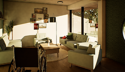
The task was to design a functional 6x8 meter space that could house 2 college students. The requirements were for there to be a living space, kitchen, bathroom and a bedroom (shared or individual).
I designed the space for two female college students with a Scandinavian style in mind, and used warm and feminine tones to make the space feel homey. This helped me to maintain a consistent style throughout the rooms, by sticking to a colour palette as well as using the same textures (brick, wood grain, metal, etc.)
While the spaces are quite open, I tried to use different visual cues to separate areas, such as carpets and dividers.
Type : Interior
Student Dormitory
- Living Room -

- Living Room -

- Living Room -

- Kitchen/Dining -

- Bedroom/Study -

- Bathroom -

- Kitchen/Dining -

- Bedroom/Study -

- Bathroom -
The way the space flows is that the user is first taken into the living room through the direction in which the door swings open. The windows along the living room walls will bring light into the living room, dining area and kitchen.
They are then led into a sort of hallway, created by a small divider to elongate the wall, that will bring them into either the shared bedroom or bathroom.
For the bedroom, I decided to give each user a bunk bed with a desk and closet underneath it, so they would both have their personal spaces on either side. In the middle, I decided to place a window along with a bench to connect the two sides, as well as putting a sofa in the corner for more socialization opportunities amongst the two roommates.
For the bathroom, I decided on a floating cabinet sink and wall-mounted toilet to give a more sleek and seamless look, while also using it as an opportunity for more counter space and storage along with some shelves. And for the shower area, I made a corner bath to create a bit more space for users to access the toilet.
Spatial Layout


Gardening + Deaf Community Centre
Type : Architecture + Interior
The task of this assignment was to redesign Block 68 Commonwealth Drive as a space for a specific group of elderly.
I chose to take advantage of the natural surrounding landscape and its benefits for deaf elderly, and also included gardening as one of the main programmes, creating many opportunities for green spaces throughout the building, along balconies, walls and the surrounding area of the building.
For this space, I used lighter tones and pastels as they go easier on the eyes, especially for deaf elderly who have heightened visual senses. I also made sure to make sure there were spaces meant for socialization with the public to encourage interaction, but also spaces specifically for deaf elderly such as therapy and an audiologist.
I also ensured that the space was open to increase visibility throughout and allow for better accessibility.
- Exterior -

- Café/Seating -

- Gardens -

- Café/Seating -

- Library -
- Group Therapy -

- Help desk/Walkway -

- Audiologist -

- ESL Lesson Room -

STAIRS
STAIRS
STAIRS
HELP DESK
CAFE
AUDIOLOGIST
RESTROOM
RESTROOM
LIFT
LIFT
LIFT
HELP DESK
ESL ROOM
ESL ROOM
GROUP THERAPY
THERAPY
THERAPY
GARDENING AREA
LIBRARY
LEVEL 3
LEVEL 2
LEVEL 1
Spatial Layout
The idea of the layout was to use coloured zones to show designated areas and lead the elderly through the space. Pink paths meant sitting areas while blue paths meant counters and help desks. They were intentionally made curved to seamlessly connect spaces and create bigger walkways.
Starting at Level 1, this space was made as a socialization space for the deaf elderly and general public to chat and relax. This would allow the deaf elderly to feel less isolated.
Next going up to Level 2 by either the lift or stairs, which were placed in front of each other for easy access, the users are led into a library and the community garden. At the end of the level, there is an audiologist and hearing aid repair place for the deaf elderly to use. In this manner, the space seemingly starts to transition from a public space into a space meant for deaf elderly.
At the third floor, this space is almost completely catered to deaf elderly. There is a help desk which then leads to two sign language lesson rooms for both the deaf elderly who struggle to communicate and anyone who is willing to learn and then therapy rooms for the deaf elderly who are struggling mentally and need support in the community.

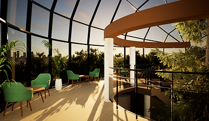
This project was our exploration of Revit's functions, where we were tasked to create a large, interesting structure and explore different tools.
I chose to try creating a dome shaped building with a sloping, spiral roof, along with some circular columns. I also used black-tinted glass in order to make the main structure seem more appealing.
I decided to make the space function as a library/recreational space for a younger demographic, so the project consists of an outdoor area with a playground and some seating, study and sitting areas, a normal library, and a kids' library.
The goal of the space was to make it feel biophilic, due to the already organic shape of the structure. I further established the organic feel of the building by adding a spiral staircase right in center of the main structure.
Type : Architecture + Interior
Biophilic Library
- Exterior -

- Exterior -

- Balcony Seating -

- Study/Seating -

- Library -

- Seating/Stairs -

- Study/Seating -

- Kids' Library -
- Upstairs Seating -

Collaborative Design Studio
Type : Interior
The site of this project was our studio in Temasek Polytechnic. The assignment was to choose two different design-related clients, in my case, Andrew Gn (Fashion Designer) and Jayden Tan (Photographer), and create a space where they can work together as well as teach the students in the polytechnic.
I did a lot of research on each user in order to find their preferred styles and tried to use two different styles to differentiate the two areas in which the users would spend their day in, with the fashion designer getting a more elegant design with a dark and warm palette while the photographer was given a simpler style with lighter tones which were a bit on the colder side.
The one thing they both had in common in their taste was the abundance of plants, so I decided to take advantage of the large windows and line the side with a dedicated space for plants, which would create a sort of indoor garden situation in the enclosed studio space.
- Runway -


- Hallway -
- Indoor balcony -

- Photography Room -

- Photographer's Office -
